_edited.jpg)

Last week, I finished my 30 Days of Accessibility Testing challenge from Ministry of Testing. I previously talked about the first 15 days of doing the challenge in this blog post, Part 1: 30 Days of Accessibility Testing. It's been a long month and there were definitely days where I skipped the challenges but still managed to pull through at the end.
I highly encourage others to take part on the challenge especially if you want to know more about accessibility testing. If you're not interested with this specific challenge, Ministry of Testing has other interesting topics as part of their 30 days of testing series. Public challenges are a great way to keep yourself accountable and also learn new skills!
Rounding up 30 Days of Accessibility Testing
Let's look at the remaining challenges in detail.
Day 16 was about finding a problem that might affect someone who can't use their hands. Many people with motor disabilities can't use a mouse so it's essential for your website to be accessible via keyboard only or other keyboard-like devices. As a tester, there are so many checks that you can do to make sure a website is keyboard friendly.
Ask yourself these questions:
When you tab to the element, ts the element focusable and has a clear visual indicator?
Can you access links by pressing the enter key? Can you access buttons by pressing either the spacebar or enter key? How about checkboxes?
Is the navigation flow logical?
When you want to access the main content, is there a 'skip to main content' link that allows you to access the content directly?
Does it allow users to navigate back and forth to different elements? Beware of keyboard traps!
Day 17 was about finding a problem that might affect someone with dyslexia. Dyslexia affects people differently but one common problem that they have is processing content. If a website has too much texts, not a lot of paragraphs and supporting images, it makes it harder for dyslexic people to understand your content. Something I learned during this challenge was that dyslexic people find justified content distracting because of the uneven spaces.
Day 18 was about using a tool to test colour contrast problems. A really simple and great tool is WebAim's Contrast Checker. Just provide the foreground and background colour and it will tell you if the contrast check passed or failed. It validates against 3 success criteria related to colour contrast and also on both level AA and AAA. The images below show example of a failed and passed contrast check:


For automated tools that you can integrate into your pipelines, both Axe and Lighthouse can validate the contrast for text elements but it will not check the contrast of graphic elements.
Day 19 was finding 5 accessibility experts to follow on Twitter! I received so many suggestions from the Twitter tech community so check out the tweet below to find out who these accessibility experts are!
Day 20 was creating an accessibility testing checklist. Here is the checklist that I came up with. This list is far from complete but something to help you get started. Feel free to download the image as well if you want to use it for your accessibility audit!
Do images contain text alternatives?
Is the website fully accessible with just a keyboard?
Is there a clear focus indicator when an element selected?
Are page titles logical and easy to understand?
Are clear error messages provided whenever something unexpected happened?
Do forms have clear labels?
If CSS is turned off, does the page still make sense?
Are the colours high in contrast so it can be easily viewed?
If the page is zoomed in (up to 200%), do the elements stack nicely together?
If there are videos on the page, are captions/subtitles provided?
When using abbreviations, are these clear and well defined?
If there are links, do the link description makes sense?
Is there a way to turn off animations and give control to the user?
If there is an audio, is there a transcript included?
When filling in forms, is autofill enabled?

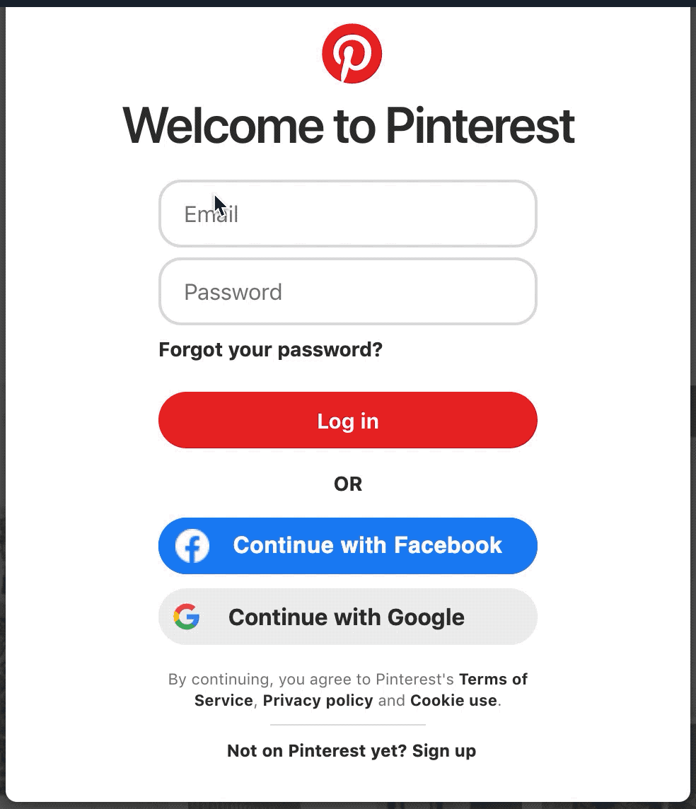
Day 21 was looking for invisible keyboard focus when tabbing through a page. I found an example when I was using the login feature from Pinterest. The focus is invisible on some of the buttons when you try to access it with just a keyboard. When I tabbed to the 'Login' button and on the 'Continue with Google' button, the focus indicator was not displayed.
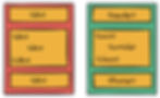
Day 22 was learning about why semantic HTML is important. Semantic HTML is about using tags that describes the content clearly. When used correctly, the tags tell the browser or other devices the meaning and importance of a content like the example illustration below.
It's important because it helps to improve your SEO and accessibility. If you want your website to be accessible, then using semantic HTML is mandatory.
Day 23 was finding missing semantic information on any website. I was browsing one site and visually, it's presented nicely but when looking at the HTML structure, semantic tags such as header and navigation were missing. As a result, I struggled a bit when I was browsing the site using a screen reader. When landing on the navigation, it just says 'List, 9 items' whereas other sites that have a navigation section will say 'Sidebar, navigation'.

Day 24 was learning about accessibility law in your country. In the UK, the Equality Act 2010 was created to address disability discrimination on the access of information services. While it doesn't explicitly mentioned that the act covers websites, the consensus is that the access of information services also applies to web services. So far, few companies have faced legal actions but they were all settled before heading to court. On September 2018, new accessibility regulations were passed to ensure that public sector websites are accessible and must include an accessibility statement on their website This impacts central government, local government and some charities unless exempted. In order to avoid getting sued, commercial websites should adhere to Web Content Accessibility Guidelines 2.1 Level AA since this is the standard that the government has adopted.
Day 25 was exploring the Before and After accessibility demonstration site created by World Wide Web Consortium (W3C). I recommend this to anyone learning about web accessibility! W3C did a really great job in showing specific accessibility issues and adding annotations why it failed. It shows how using semantic HTML, adding alternative texts to images when necessary, making links focusable, using the correct font and adding form instructions (to name a few!) contributes to better web accessibility.
Day 26 was finding an accessibility issue on a website and report it.

I reported this issue to a colleague of mine from another team as the video controls were hard to see due to its low contrast. There are also no subtitles so lots of improvements needed here!
Day 27 was about learning how to use your mobile screen reader. I have VoiceOver built in on my phone and it took me some time to learn some of the commands but this VoiceOver documentation from Apple is really informative. The commands below have helped me get started. I've created an image as well which you are free to download.
To activate or turn VoiceOver off, triple click side or home button once the accessibility shortcut is enabled.
Touch screen to select or hear an item
Swipe right to select or hear next item
Swipe left to select or hear previous item
Double tap to activate selected item
Two finger tap for VoiceOver to pause and continue
Two finger double tap to start or stop any action such as playing and pausing videos or music or taking pictures
Swipe up from bottom of screen and wait for haptic sound to go back to home screen
Swipe down from top of screen and wait for haptic sound to access control centre

Day 28 was testing a word document for accessibility. I downloaded and tested this document online and with Microsoft Word there is a built-in accessibility checker that you can use. I enabled accessibility checker and issues such as missing alt text and low contrast were reported.
I managed to fix the accessibility issues by adding alt text on the logo as well as changing the colours that are low in contrast. The issue with the table not having the correct reading order, I'm unsure how updating the style of the table as well as adding alt text to the table fixed the issue. I need to look into this next time!
Day 29 was finding three accessibility issues without using an evaluation tool. I was browsing Charities Age Foundation and found the following issues.
No keyboard focus on most of the elements when you tab through them which makes it hard to interact.
You can tab to the search field and autocomplete is added as a feature but when you want to do the actual search, it doesn't work. I tried pressing enter, tabbing to the search icon and press enter or spacebar but it didn't work for me.
Hovering on the social media icons do not indicate that they are supposed to be clickable as there is no visual indicator.
Day 30 was reviewing the complexity of a website's content using Hemingway. I checked it against one of my blog post and it says it has a Grade 8 readability which is good.

Lots of room for improvements especially with using complex words and removing words that are not needed. I specifically liked this tip "Be bold, don't hedge".
Final Thoughts
There you have it! 30 days of accessibility testing challenge complete! I'll be taking a short break but I will definitely do a mores challenge in the future. I'm so happy as well to see that other people are also doing the challenge if you search for #30daysoftesting in Twitter!